Brazil
Caribbean
Germany
Italy
Mexico
Portugal
South Africa
The Middle East
Spain
USA
Madagascar
Maldives
UK


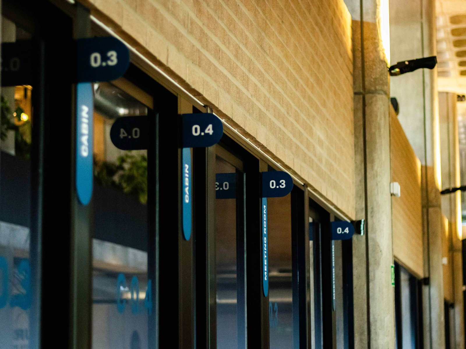
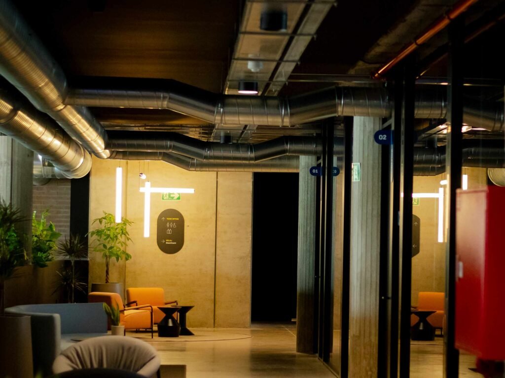
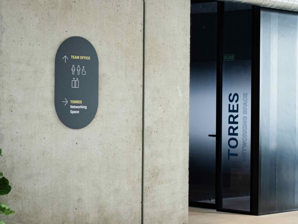
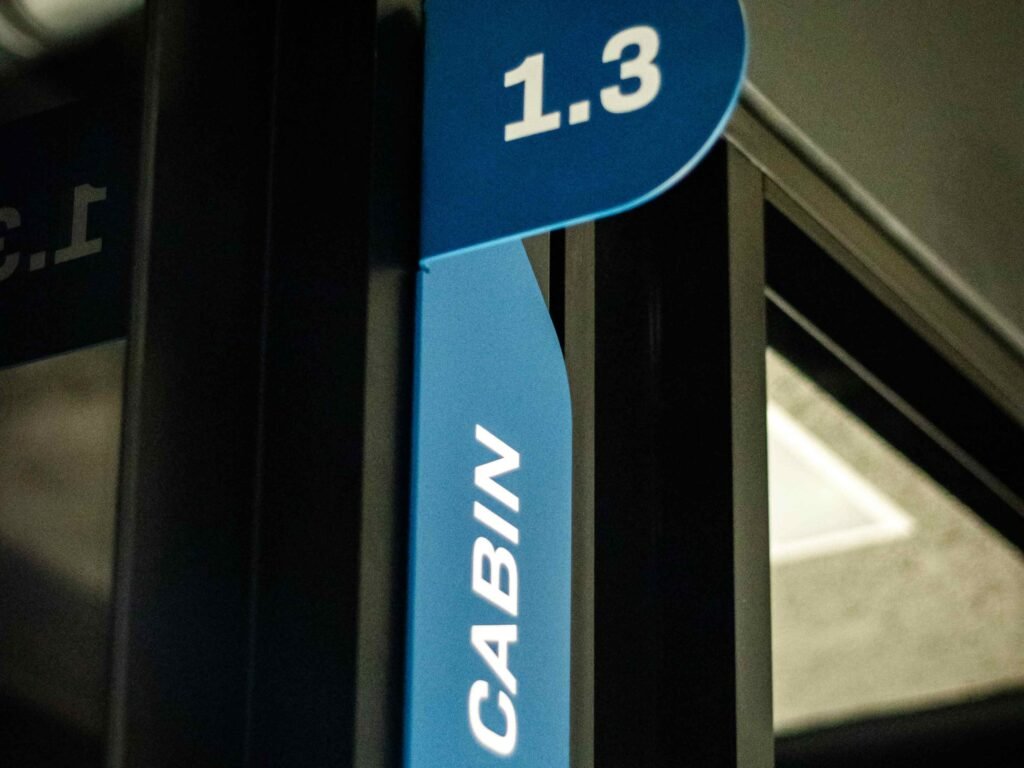
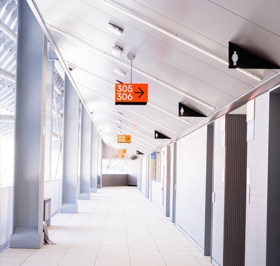
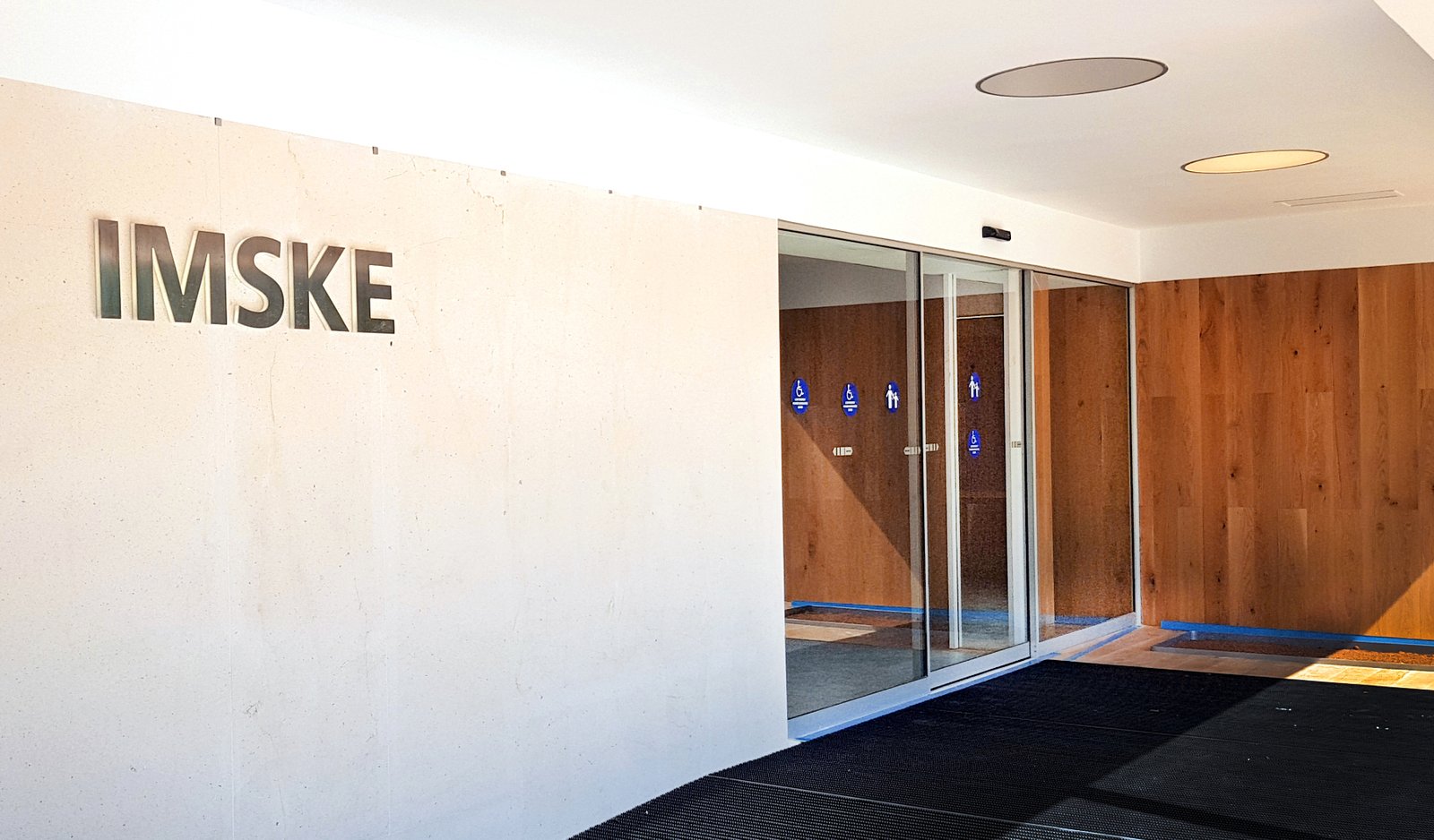
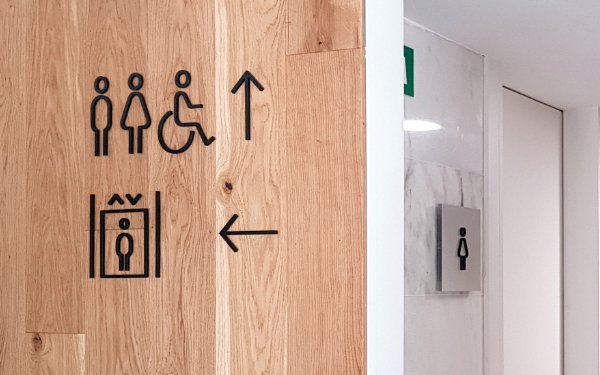
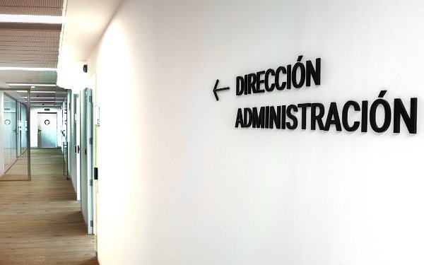
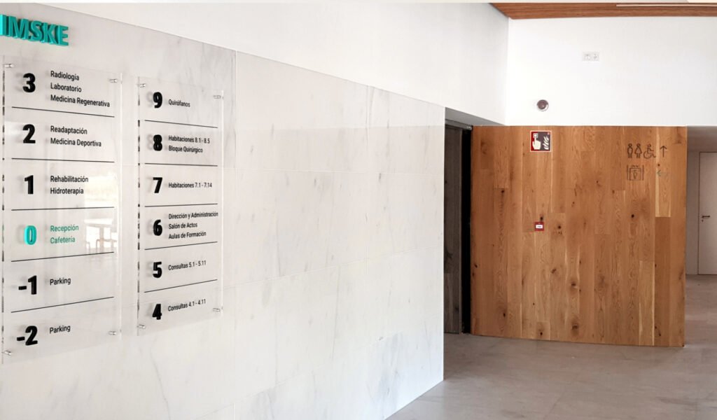
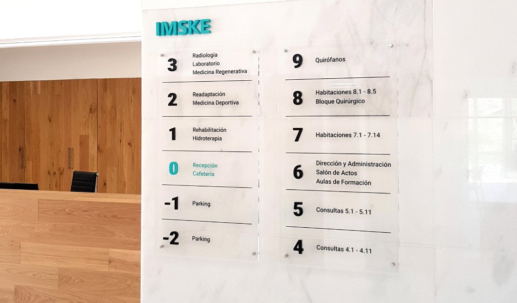
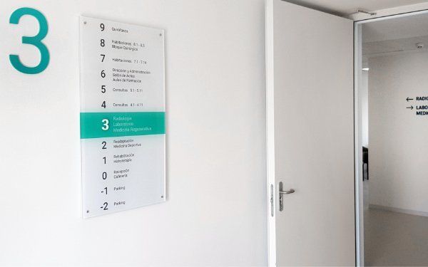
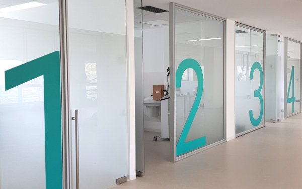
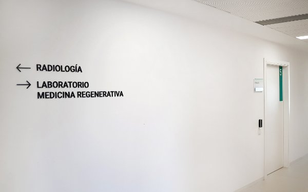
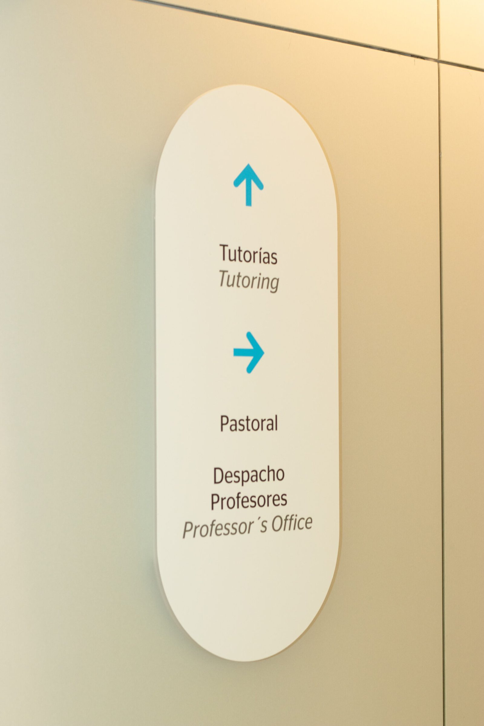
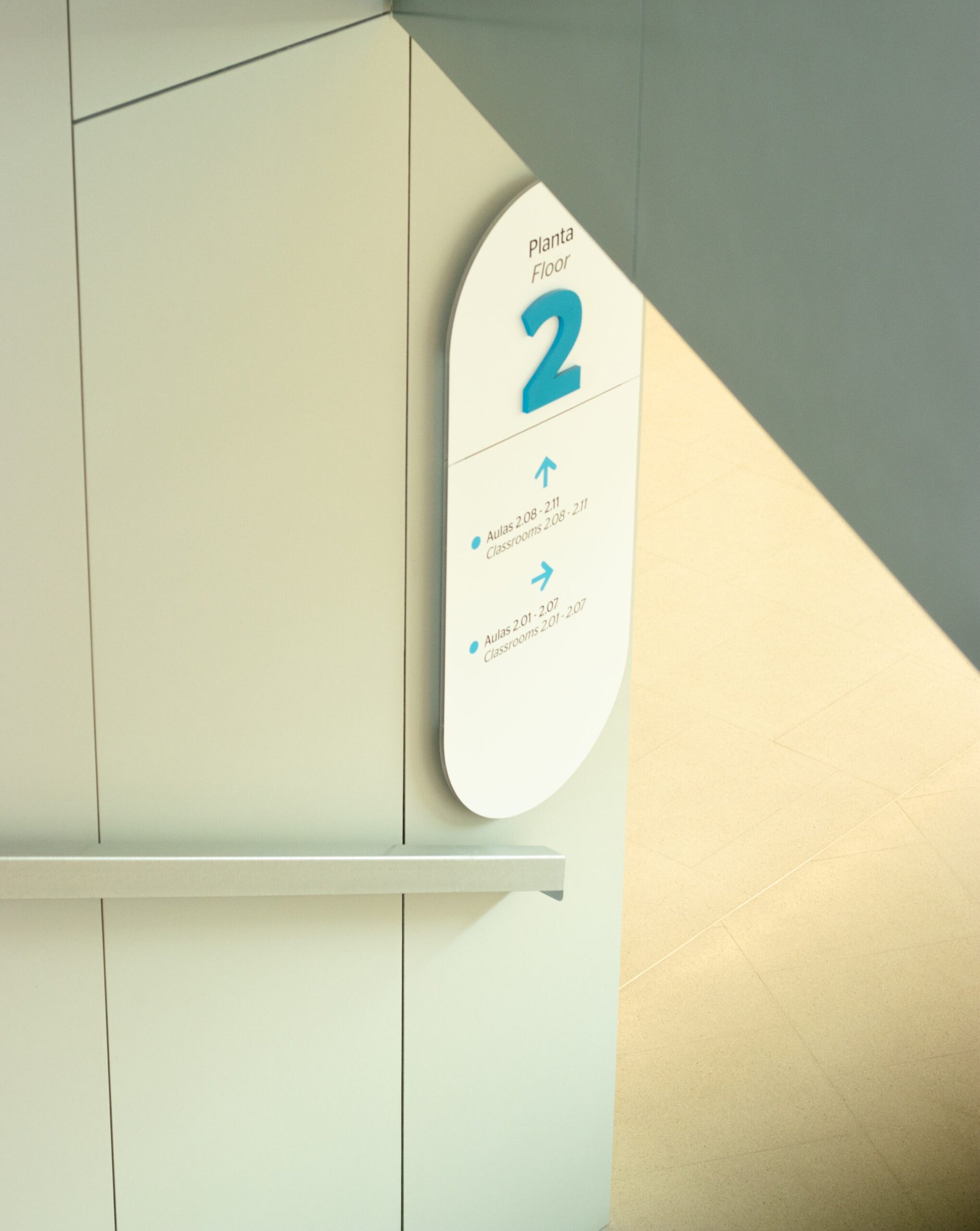
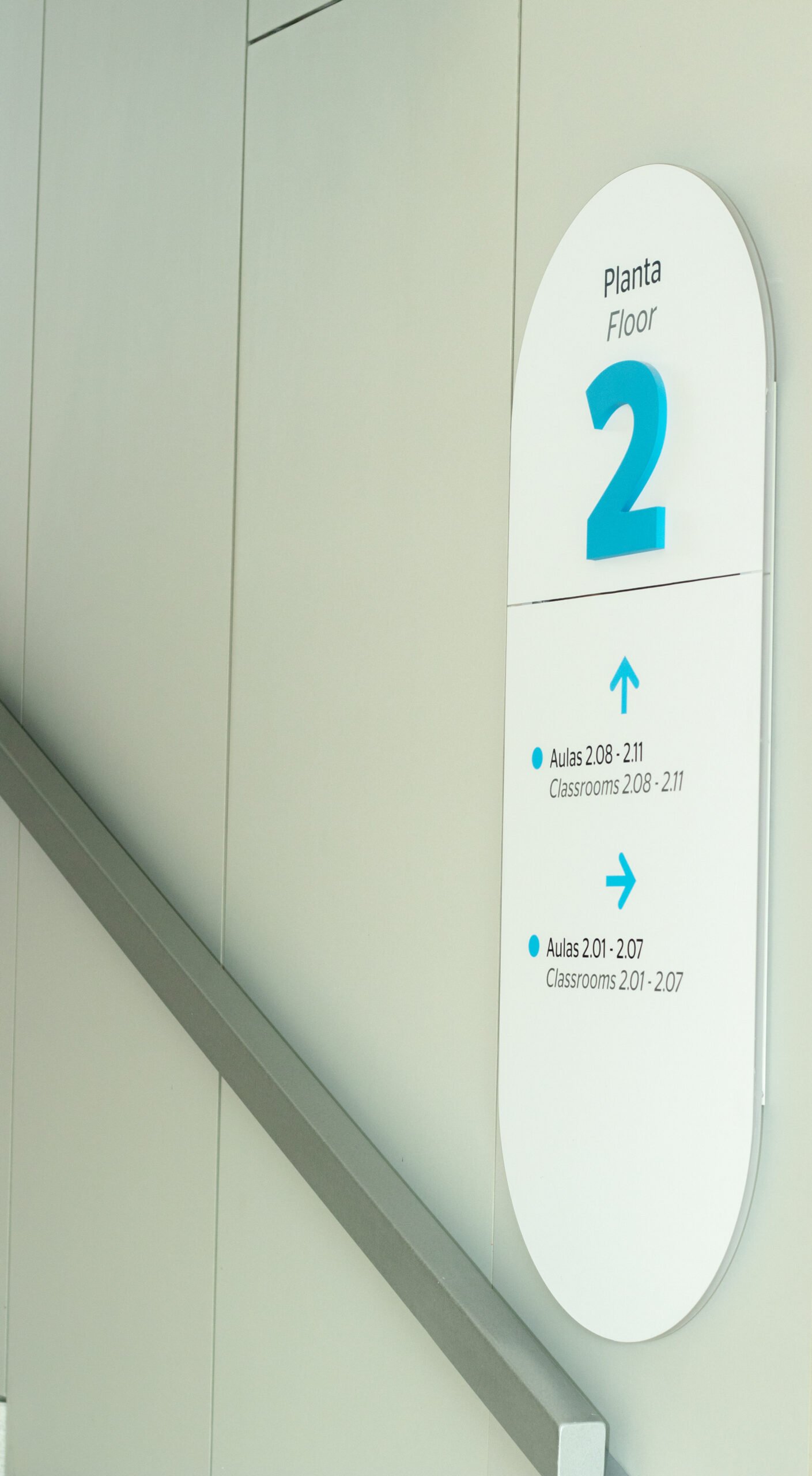
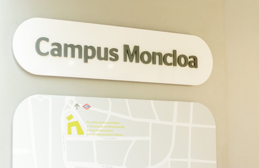
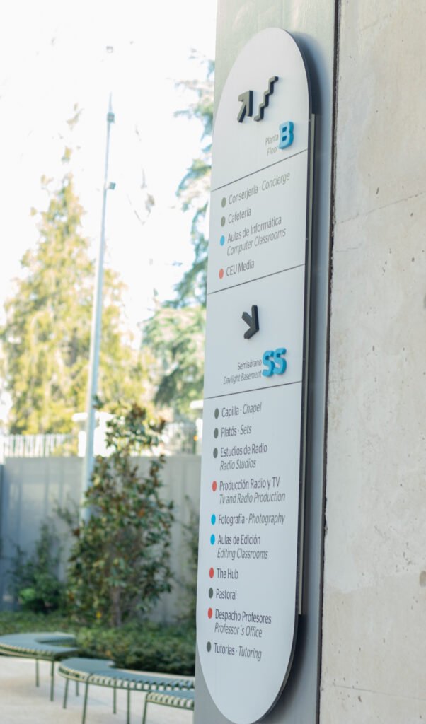
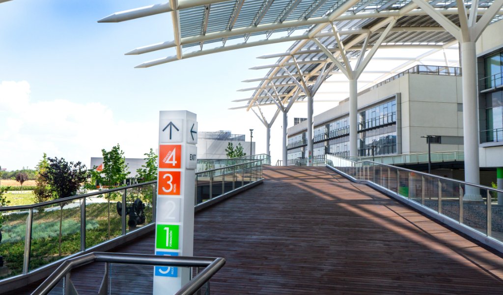
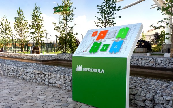
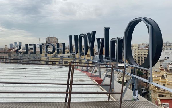
Signage and Wayfinding


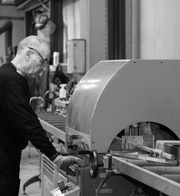
Signane | design Production

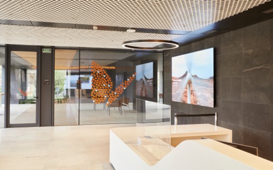
Corporate image

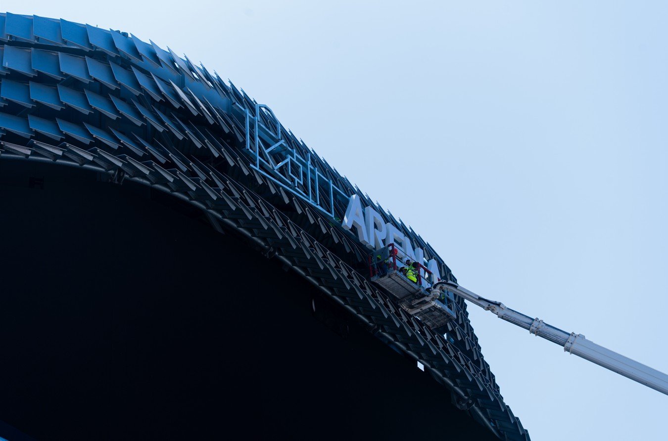
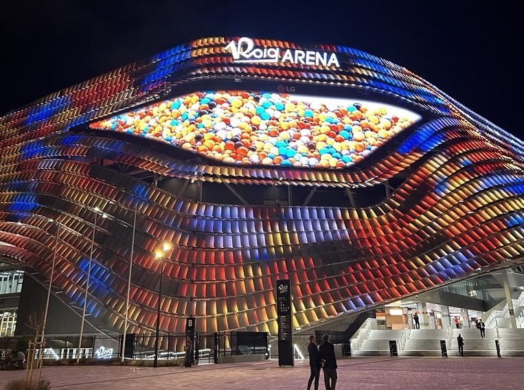
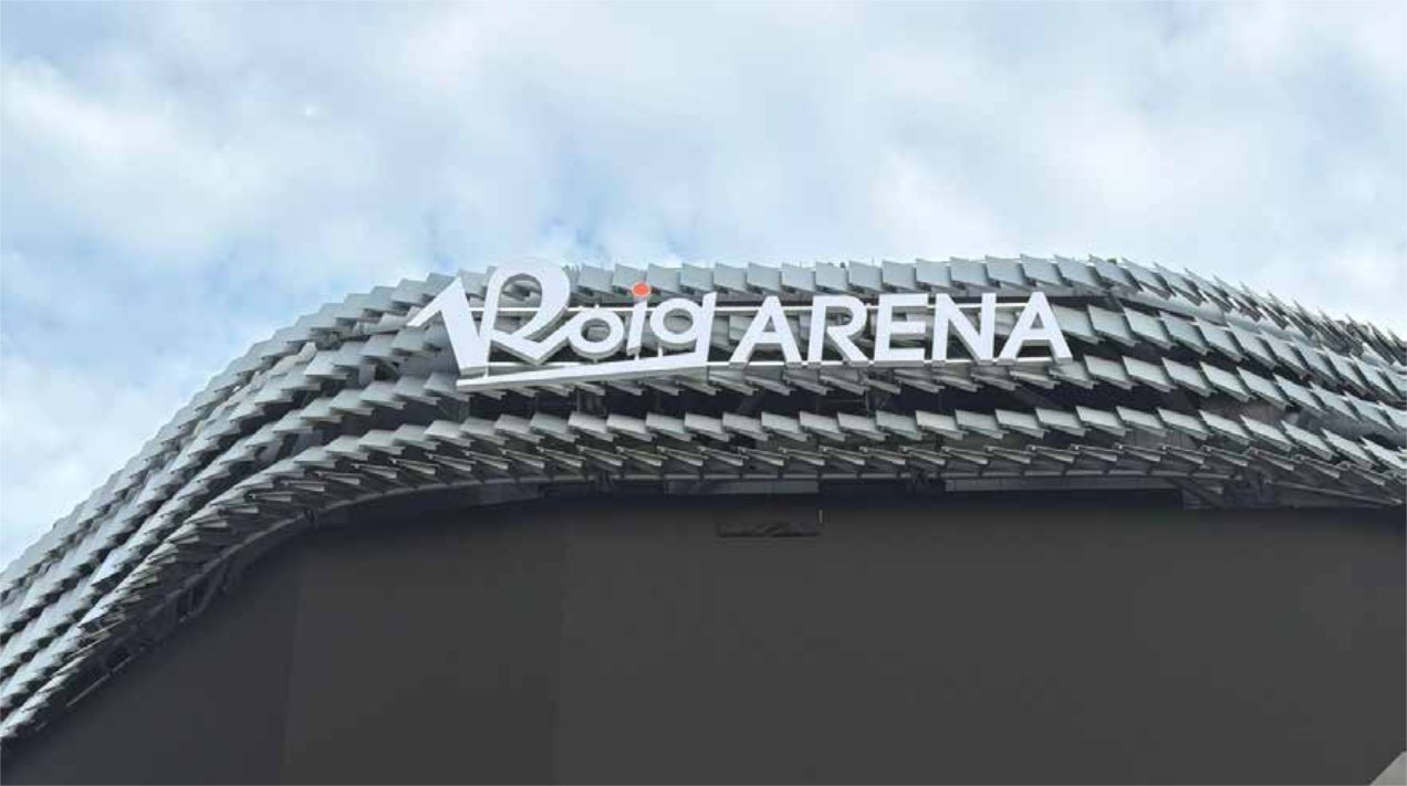
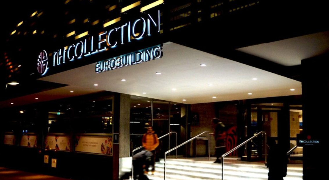
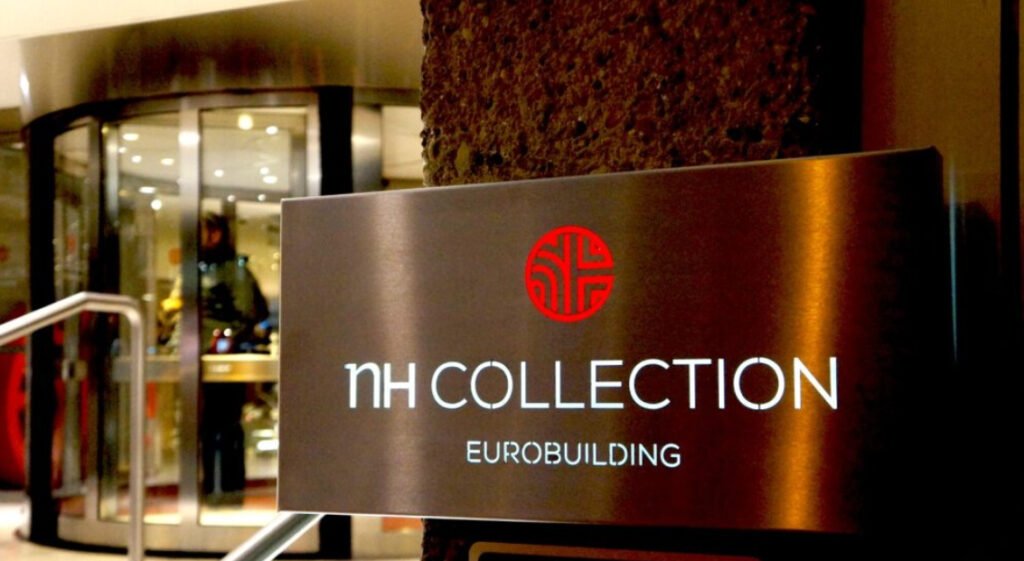
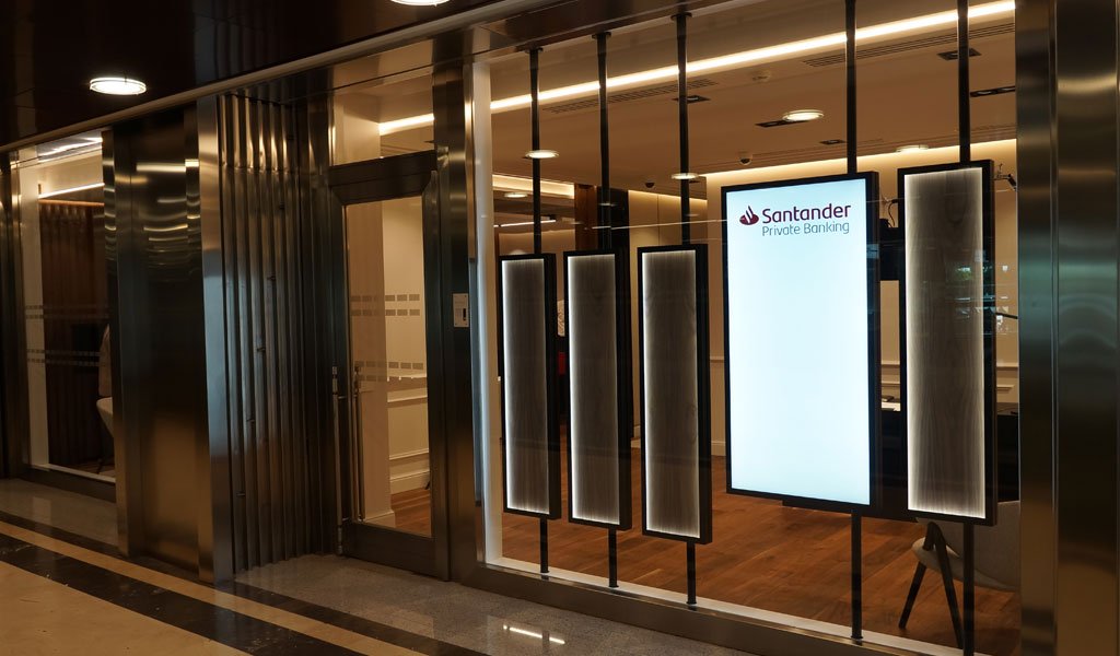
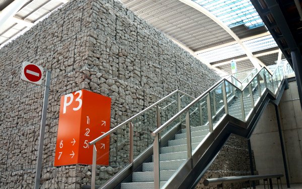
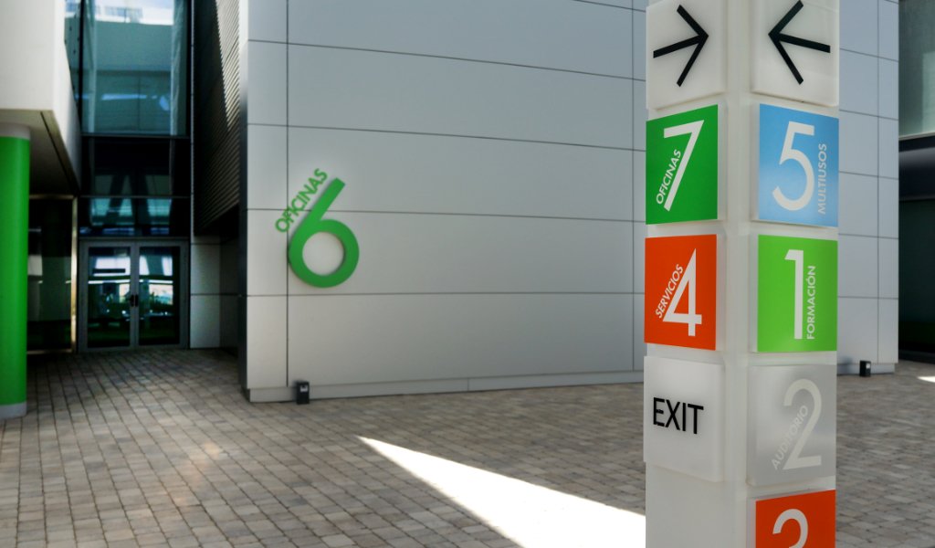
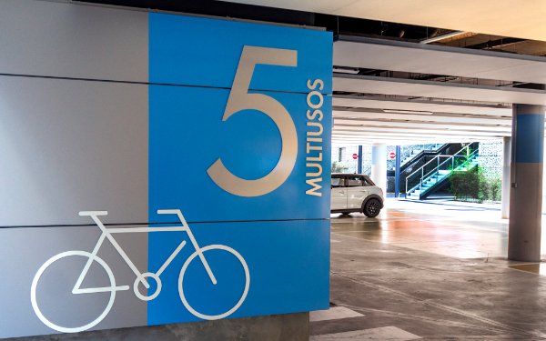
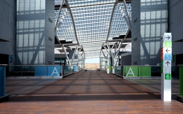
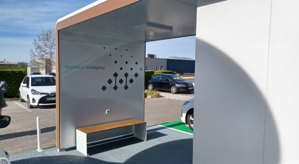
Wayfinding and Outdoor Signage

New office model

Signage and Wayfinding Design
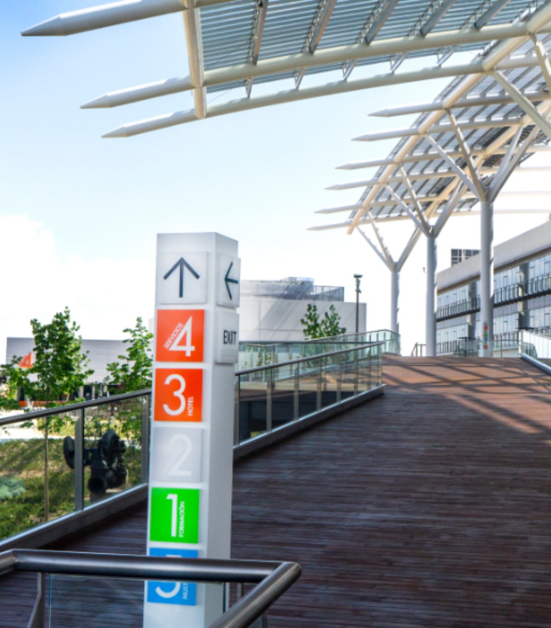
Wayfinding and Outdoor Signage


César Pardo
CEO

Auxi Postigo
Chief Financial Officer

Ana Postigo
Commercial and Design Director

Jorge Moliner Falcó
Marketing and Innovation Director